How to Get Started Simply With The Divi WordPress Theme + Builder
“When one door of happiness closes, another opens; but often we look so long at the closed door that we do not see the one which has been opened for us.” - Helen Keller
Hey beautiful Mama!
This post is going to be all about the wonderful, amazing, fantastic (I could go on and on) Divi Theme!
I rave about Divi all the time because I absolutely love it!
It does everything I need + more and I couldn’t imagine using anything else on my blog.
It’s by far the best theme and page builder I’ve ever come across (and I’ve used a lot)…
Before we get into it though, if you’re new to blogging and want to make sure it’s right for you, go here first to check out Is Starting a Blog right for You post…
Or you can go here if you want to know how to start your mummy blog!
Onwards now to How to Get Started Simply With The Divi WordPress Theme + Builder…
(Disclaimer: I've recently moved away from Divi, however, I still feel it is the best theme for a blog when just starting out on WordPress)
Having a fab theme is a must when you have a blog because you need to be able to work with something versatile, reliable and simple.
You want to be able to get done what needs to get done and enjoy the process.
Trust me, you won’t be disappointed and when you start using Divi – you won’t look back…
So let’s get into it and check out the world’s most popular blog theme (their words not mine).
“This post does contain affiliate links throughout and if you make a purchase using one of my links, I receive a small commission at no extra cost to you”.
Divi is a premium WordPress theme (you can also purchase a standalone plugin) which can help you design your blog or website using it’s awesome visual, drag-and-drop editor.
It will transform the way your blog looks and feels, with it’s efficient, effective and completely customisable framework.
The great thing about Divi is, it isn’t just for web designers, it’s for EVERYONE and that means you my lovely…
Even if you’ve never built a blog before, this is super simple to use and I’m going to show you how.
Before we get into it though, I just want to clarify one thing!
Divi has a Theme and Page Builder.
You can use the theme, which has the page builder inbuilt, or if you’re using another theme you love and don’t want to change, you can use the page builder plugin and still have the use of the amazing visual editor…
Either way, you’re going to get a great user experience and have an awesome looking blog, whichever one you use!
Is the Divi Theme good for Blogging?
Divi is absolutely fantastic for bloggers because it’s simple and easy to use.
If you want to create a unique and beautifully designed blog or website, then Divi can help you do that using it’s easy peasy drag-and-drop builder.
Creating individual pages and even different blog post layouts can make your blog stand out from the crowd.
Why is Divi so popular?
Divi is super popular amongst bloggers and web designers. Some of the reasons why are:
Ease of use
Live previews + building on the front-end
Versatility
Professional look without being techie
Pre-Made Templates
Tons of features (effects, bulk editing + transformations to name a few)
Reasonable annual cost
Modules for anything + everything (call to actions, sliders, post title etc)…
Can build any type of website using it
Simple CSS Coding if required
Saving templates + designs (making it much easier + quicker for you)
How much does Divi Cost?
Divi is super affordable and when you join, you have access to many things including website packs, premium support and regular product updates etc…
It costs $89 per year or a one time payment of $249, which gives you lifetime access.
What’s the difference between the Divi Theme and the Divi Page Builder?
Not that much really, apart from the fact the Divi theme includes the page builder, so you don’t need to download the page builder plugin separately.
There are, however, some different things within the Divi options bar in the dashboard.
Divi Page Builder Plugin
The plugin offers fewer options than the theme, but the options are as follows:
Updates
Here is where you enter your username and API Key information you would have received when you purchased the membership.
It’s essential you add these in so that the plugin can be regularly updated.
Having a theme that is updated regularly is an absolute must because it’s these updates that maintain your blog’s functionality, speed and readers user experience.
The details on the screen here tell you exactly how to enable the updates, so make sure you go ahead and do this.
API Settings
I don’t touch anything on this screen, although you have the option to enter a Google API Key if you’re wanting to use Google Maps on your blog…
Post Type Integrations
This is where you get to enable the Divi builder on posts, pages and projects.
You can toggle it on and off depending on where you want to use it.
Advanced
I leave all the options here at the default settings and I’ve highlighted in the box the two options I wanted to draw your attention to.
You want to make sure that the “latest Divi builder experience” is always enabled and then you can choose whether you want the classic editor or the Gutenberg editor.
It’s totally up to you which editor you use.
Check them both out and see which you’re more comfortable with and like using the best (although the classic editor will be phased out from what I’ve heard).
Next up we’ll take a brief look at the “Theme” option…
Divi Theme (with in-built page builder)
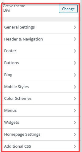
If you use the Divi theme, then there will be many more options because you’ll have the theme customizer, so you can create the whole look of your blog (like you would with any other theme installed).
Below is the default theme, which comes pre-installed and you can see the customization options available.
The screenshot below is of the Divi Theme and you can see how many more customization’s you get, meaning you have way more things to make your blog awesome and unique.
Let’s get either the Theme or Page Builder plugin installed – so you can get building your blog…
How to install the Divi Theme or Page Builder Plugin
When you purchase the Divi theme from Elegant Themes, you purchase it as a membership and get access to not only the theme and page builder but some other options as well:
“Extra” theme, which is a magazine theme
“Bloom” which is an email opt-in plugin
“Monarch” which is a social sharing plugin
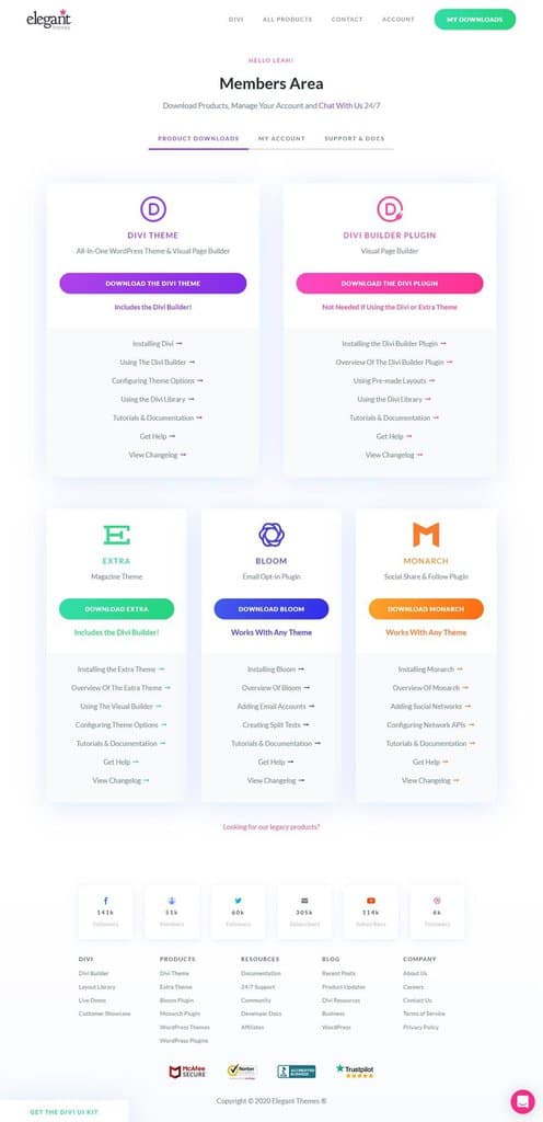
One membership basically gives you access to everything you need to create a beautiful blog.
Once you have purchased the Divi theme, you have the option to either install the page builder plugin or the whole theme, like we talked about above (which you do as per the instructions below):
From your dashboard, click:
Appearance
Add New
Themes
Upload Theme
Choose File (upload the Divi Theme zip folder you downloaded from the download screen and install and activate)
When you’re on the Elegant Themes Members page, you’ll be able to see the two different options Divi offers.
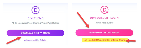
You can see that it even says on the “Divi Builder Plugin” that you do not need to use the plugin if you’re using the Divi theme.
If you upload the plugin only (because you have another theme installed) you do the following:
Plugins
Add New
Upload Plugin
Choose File (upload the Divi Plugin zip folder and install and activate)
Woohoo, so you’ve now decided whether you need the Theme or Page Builder and installed it…
Divi Theme Customisation’s
The Divi Theme has a ton of things you can customise and you can find all the initial settings by clicking on Appearance and either Customise at the bottom of the screen or from within the menu on the left.
Here is where you can set the whole look and feel of your blog, from button colours to the logo you want (plus everything in-between)…
I’m not going to be covering every single thing under here (boring 🙁 and would take forever) but there are a handful of things I want to briefly mention for you, to help you out!
Site Identity
There’s a couple of things in here you need to do…
First up is the tagline!
But what is a tagline:
A tagline is just a short sentence, or phrase, which needs to help your readers learn what your blog is about instantly.
You can also add a site icon (also known as a Favicon) which needs to be 512px x 512px.
It’s an icon that symbolises your brand and it shows up in the browser, making your blog look professional.
I created my favicon in the program I use called Canva, another amazing tool I couldn’t be without…
I use it for pretty much all my graphic design 🙂
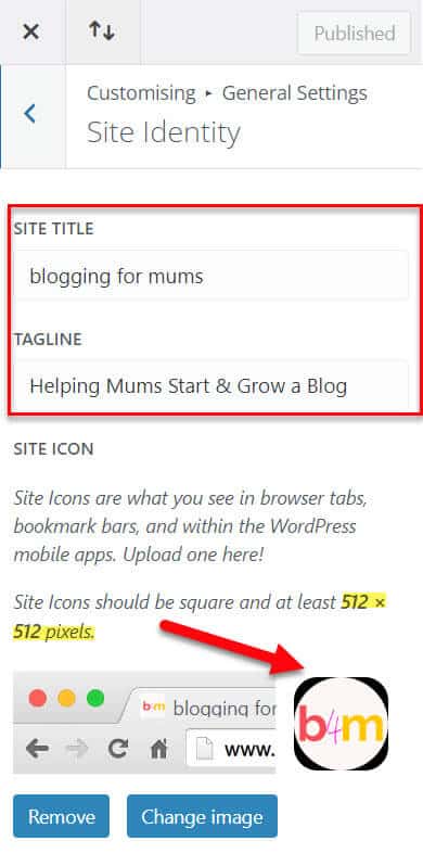
Elegant Themes have you covered with all the customisations.
Divi’s Footer
I’m mentioning the footer of your blog because you really want to utilise this section and have your important information placed here.
I have my support email address, disclaimers and links to my legal pages…
Put all the important stuff here that’s required and that you think will benefit your readers.
Widgets
This area is where you can customize the look of the widgets that you add to your site.
BUT… What is a Widget?
A widget is a block of content that is used to control a specific function and can be added in various places on your blog.
You add the actual widgets in a different section (Appearance > Widgets) as you can have different widgets in different parts of your blog (sidebar, footer etc)…
Buttons
Buttons are used for things like Call to Actions and you can have them anywhere you like.
Below are two of the CTA (call to action for short) that I have on my blog…
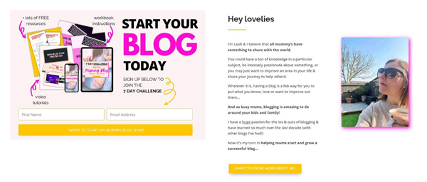
You can customise your buttons exactly how you want them and can have different style buttons on different posts and pages.

Divi Mobile Styles
This is where you can set customisations for the different devices.
This is really important as the majority of people tend to view blogs and other things online, using their mobile phones and tablets, so you want to make sure your text and posts look right on each one.
Here you can customise the header text size, the body text size, the section and row height.
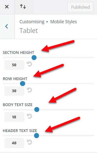
See what looks right around all the other customisation’s you’ve made.
Divi’s Homepage Settings
This is where you decide which page you’re going to have as your homepage when visitors come to your blog!
The “Classic” blog style is where you have “Your latest posts” showing and is what a lot of blogs tend to do.
I have “A static page” as I created my own home page and this is what I want people to see when they first visit my blog!
It has links to the posts I feel can help my readers the most when they’re just starting out, along with other information I feel is fab for people to read when they first enter my blog.
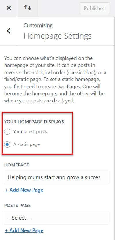
What can you do with the built in Divi Page Builder?
Divi has so many different things you can do with it and I’m going to go through some of them now…
My aim is to always make things as simple as possible for you, but some things will just come up as and when you use them and become more familiar with time.
So let’s get into it…
How to Create Your First Page Using Divi’s Page Builder
Before we get into all the nitty-gritty, I want to say that because a lot of the sections, rows and modules have the same elements, I won’t be repeating myself, because it’s not only boring for you, but it’s also a waste of both our time.
Each module has tons of elements within it, but these tend to be the same for all of the modules within the builder!
So if we come to an aspect that has already been covered, I will only cover it very briefly…
To start, Add a New Page and when the editor opens, add a page title that resonates with what your page is going to be about.
Then click on Use Divi Builder…
You then get 3 options:
Build from Scratch
Choose a Premade Layout
Clone Existing Page
Build from Scratch
This is exactly what it says and you build your page from the ground up, adding everything from scratch.
Choosing a Premade Layout
This is an amazing option, because Divi allows you access to hundreds of premade layouts, making the whole “page creating” stage so simple and easy!
I created all my pages using premade layouts and tweaked them to make them unique to me and my brand.
This is also where your saved layouts go, if and when you save them as you create.
Again, this is something I do regularly and when I create a certain module, which I know I’m going to use again, I save it so I can use it again and again and not waste time creating it from scratch.
Clone Existing Page
Here is where you can select a page you’ve already created and duplicate it for a new one.
This is a HUGE timesaver and will make creating pages super quick and easy for you!
I again use this a lot, so that all my pages are congruent to my branding.
Before we start actually building, I want to cover the 3 main elements which will enable you to actually create a beautiful page.
The 3 main elements, which everything else umbrellas under are:
Sections
Rows
Modules
BEFORE STARTING, MAKE SURE THAT EVERY TIME YOU AMEND AND CHANGE A SECTION, MODULE, ELEMENT ETC, YOU SAVE IT… ALSO, ALWAYS REMEMBER TO SAVE EVERYTHING BY CLICKING THE BIG GREEN “SAVE” BUTTON IN THE BOTTOM RIGHT-HAND CORNER TOO AS YOU DON’T WANT TO LOSE ALL YOUR HARD WORK!
I wanted to make the above statement bold and stand out because it’s so easy to forget to save work (yep, I’ve done it a few times).
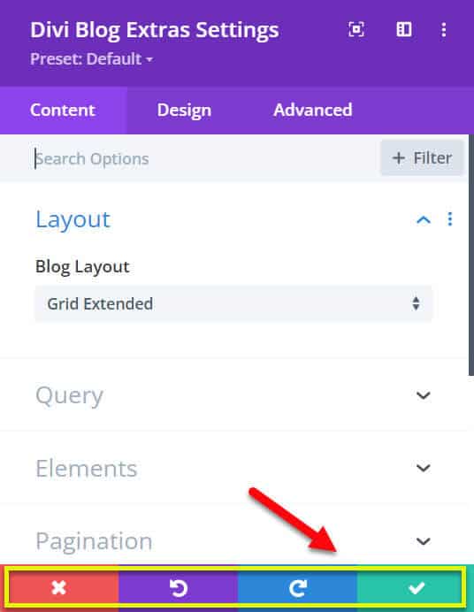
You save it by clicking on the big green box with a tick in and then you also need to click the other green box in the bottom right-hand corner, when you want to save everything you’ve done before you exit the builder.
As well as the “Green tick and Save” buttons, you also have 3 other buttons at the bottom of each module.
The red cross is to “Discard All Changes”, so if you click this, it will just click off and you’ll lose everything you’ve done within that module.
The purple “Undo” button simply undoes the last edit you carried out.
The blue “Redo” button simply puts back the edit you carried out if you clicked undo by accident.
That was a mouthful to get out…
Divi Sections
The sections are the largest building block within the Divi builder and they’re used to group your content into individual and distinguishable areas.
Everything you build within Divi starts with the section element and the section wraps all your content together nice and neatly.
New Section
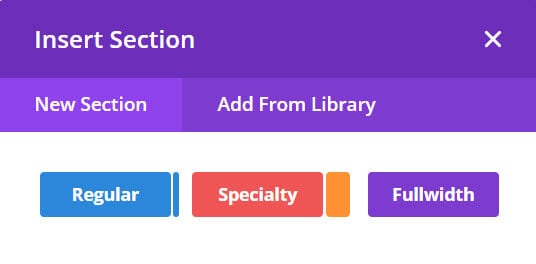
To add a new section, you find the blue circle with a white cross in it, which says “Add New Section” when you hover over it.
You then get different section options to choose from, including (regular) blue, (speciality) red and (full width) which is the purple colour!
We’ll start with the regular one, as that’s the one you’re probably going to be using the most!
Regular
The regular option tends to be for your everyday content.
Speciality
This is for when you want to get more creative with your layout use, as you can have more advanced column structures, which you can add more complex column variations and full-spanning vertical sidebars.
I’ve created an example for you in the screenshot below, so you can see the different layouts and styles you can have with a speciality format section.
Full Width
This section is used when you want to cover the full width of the browser and only certain modules are able to be used within this section…
The difference here is that there are no columns or rows to work with, as everything expands to 100%.
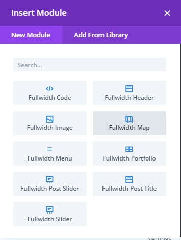
As well as adding a “New Section”, you also get to “Add from Library”.
Add from Library
You need to actually have things in the Divi library though in order to do this.
As you save sections, rows and modules over time, your library will grow and you’ll be able to use this feature.
Section Settings
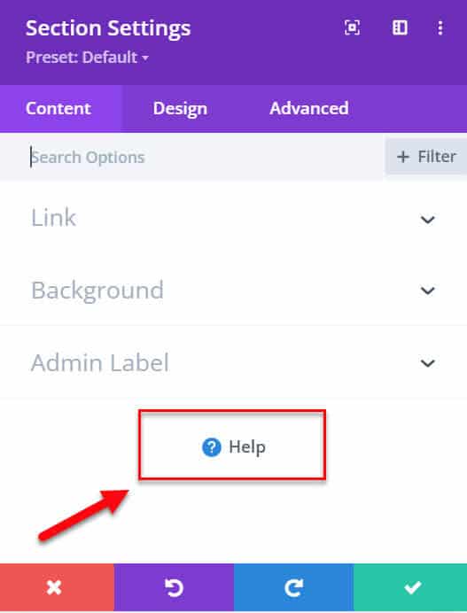
Under the Section Settings, you’ll find the Content, Design and Advanced tabs.
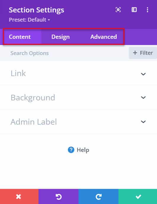
Here is where you can add the content and change the design of that particular section.
Handy Tip: Another handy tip I want to quickly share with you, is that there’s always a little “help” section at the bottom of the modules, where you can click and a “Divi Builder Helper” pop-up appears with helpful videos, which you can watch right there and then within the builder. There’s also a tab for “Keyboard Shortcuts” which shows you all the shortcuts you can use.
Divi Rows
The row elements are very similar to the “Section” elements, where you control the settings for the whole row.
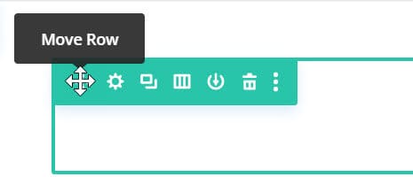
You can see in the image below all the options available…
First, you have the cross, where you’re able to move the row up and down on the page, to wherever you want it to be applied.
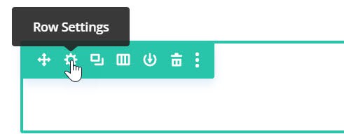
Second, there’s the settings where you can amend the column structure and the design of the whole row (background colour, border, box-shadow etc).
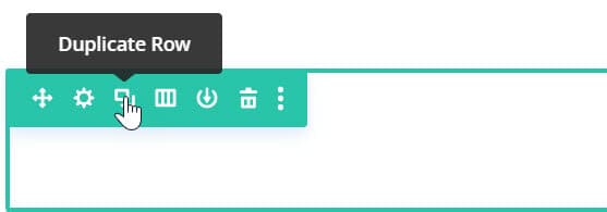
Thirdly, you have the duplicate row where you can duplicate the whole row you’ve designed.
Next up is the little gate symbol, where you can change the column structure to show however many columns you want in the row.
The downward arrow symbol is the next element and this is where you can save the row to the Divi library.
The final symbol is the little bin and this is for deleting the entire row.
The three little dots at the end are other options, such as split testing, which is great if you want to test different designs of the same rows, reset row styles, make styles default and many more you can check out.
Within each row, you can then choose modules to create your content.
Every module has a Content section, a Design section and an Advanced section.
Pretty much all of the elements within these are the same, with one or two exceptions, where there may be a couple of added extras.
They’re all pretty uniform and it isn’t difficult to figure out what needs to be added, as Divi is clear with everything and gives you help options (a little question mark) everywhere.
If you click on each item and have a play around with them, you’ll soon get a feel for what everything does.
I do just want to point out as well, that when you’re working on a particular module if you scroll over the text or whatever you have on the page, it will highlight what area you’re currently working on (as per the image below).
Most elements which you can make changes to have the four little icons next to the element title as well…
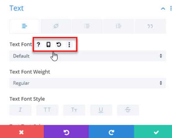
Question Mark Icon
Click on this if you need help knowing what the element is.
Phone Screen Icon
This is where you can click on each item (Desktop, Tablet & Phone) and see what it looks like on each device.
Arrow Icon
This undoes an action you’ve just taken.
Three Dot Icon
This is where you have some options to copy, reset, make style default etc.
Divi Modules
The modules are the most exciting elements to play around with.
I’ve listed all 37 of the Divi Modules below, however, I won’t be going through them. Have a play around with them, so you can find out what they do and how they look!
Once you know how it all works, it makes building your blog a lot simpler and quicker for you.
Divi’s 38 Modules
Accordion Module
Audio
Bar Counter
Blog
Blurb
Button
Call To Action
Circle Counter
Code
Comments
Contact Form
Countdown Timer
Divider
Email Opt-In
Filterable Portfolio
Gallery
Login Settings
Map
Menu
Number Counter
Person
Portfolio
Post Navigation
Post Slider
Post Title
Pricing Table
Search
Shop
Sidebar
Slider
Social Media Follow
Tabs
Testimonial
Text
Toggle
Video
Video Slider
Divi Global Presets
The next thing I want to share with you, which is a game-changer, is the Global Preset Settings…
This makes designing your blog so much easier and saves you a ton of time!
This global setting gives you the option to manage your whole blog design, right inside the builder.
You won’t need to apply colours, fonts etc to every single page, as you’ll be able to change their default design.
This then means that whenever you apply that module to a page, you won’t need to manually go through and make all the changes each and every time!
If you want to set certain header styles (H1, H2, H3 etc) or a default button to use for call to action, by saving it as a “global setting”, you’ll be updating this module for your entire blog.
This in turn means that if and when you want to make a design change to your whole blog, by simply altering the default design settings, the changes will take effect everywhere, saving you so much time and effort.
Of course, if you want certain modules to be different and unique, this isn’t a problem, as you can still change individual modules as and where you like…
Take a look at what I mean below:
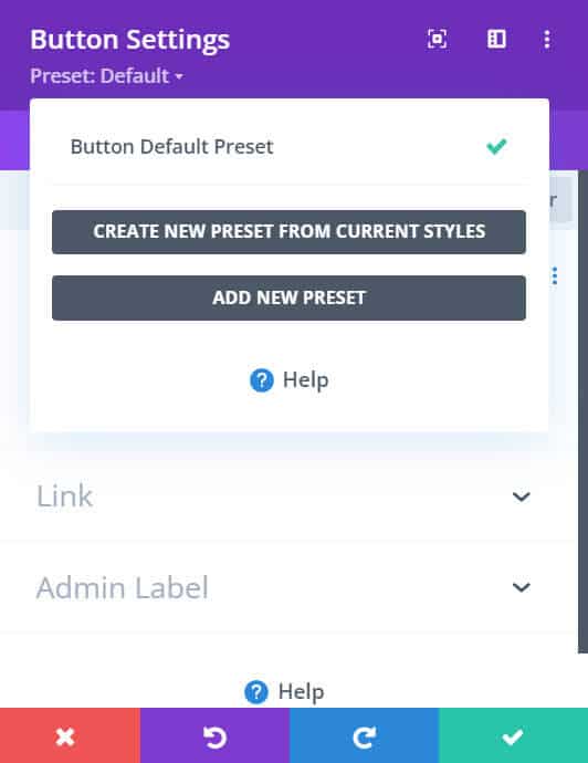
You can change the global settings for any module and if you have pages which you want to be congruent and branded, I highly recommend you do so, to save yourself much needed time for other blogging things on the agenda.
Find out more on Divi Global Presets within this article.
Another thing with Divi I wanted to bring to your attention, is how simple and easy it is to use alongside the built-in and standard Gutenberg Editor.
When creating posts and pages, it’s easy to switch between the two when using the block editor, because you can add in a “Divi Layout” block, as per the image above.
This allows you to use all the Divi modules anywhere on your posts and pages, in amongst the standard editor, creating more unique and amazing posts and pages!
I think that’s it…
We’ve covered all that you need in Getting Started With The Divi WordPress Theme + Builder!
I feel I’ve mentioned everything important within the Divi theme, for you to be able to use it and create an amazing looking blog, however, if you come across anything I haven’t talked about, or you get stuck, just reach out to me and I’ll help where I can!
With anything this in depth, I’m bound to have missed something out along the way.
Before we leave the world of Divi, I want to say again how truly amazing and wonderful this blog theme is…
I’ve honestly never used anything so versatile, robust and enjoyable when it comes to creating my blog!
Blogging is about helping people and providing a great user experience for when readers visit your blog.
Using Divi gives those readers that great user experience, but it also provides you with a fantastic design experience too, making blogging fun and exciting (which is what it should be)…
So there you have it, all the info on how to get started simply with the Divi WordPress Theme + Builder…
